Lettering Procreate Brushes
Updated September 2026
Lettering and calligraphy Procreate brushes for iPad: modern script, brush pen, vintage hand-letter. Free & premium downloads.
Brusher has 6 lettering Procreate brush packs — modern script, brush pen, calligraphy — each a native .brushset that installs into Procreate in one tap on iPad.
Lettering and calligraphy Procreate brushes turn your iPad into a full brush-pen studio. A good set gives you the thick-to-thin contrast of a real pointed pen — heavy on the downstroke, feather-light on the upstroke — without the ruined nibs and dried ink. Whether you are scripting a wedding invitation, a logo or a hand-lettered quote, the right brush does most of the work for you.
This collection focuses on the brushes calligraphers actually use: flexible monoline and brush-script pens for the letterforms, textured pencils for roughing out a layout, and a couple of shadow and highlight brushes to finish the piece.
Lettering Procreate Brushes
Procreate Video
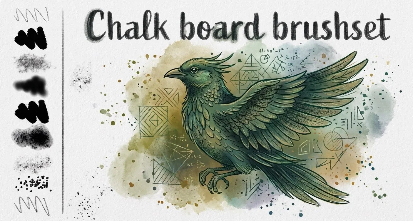
Chalk Board
rough, smooth chalk and grainy chalk
Procreate Video
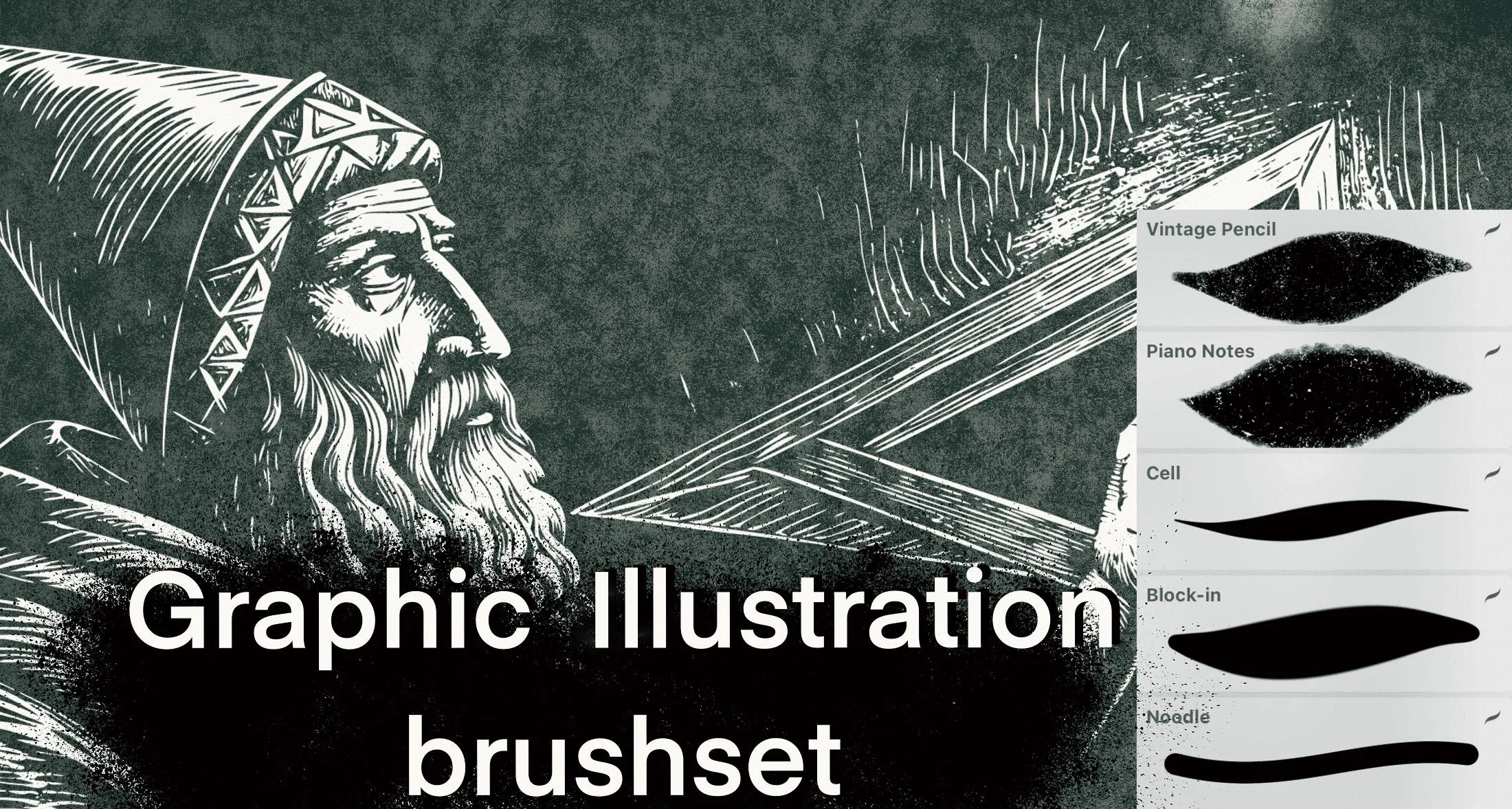
Graphic
vintage textured pencil, block-in and noodle
Procreate Video
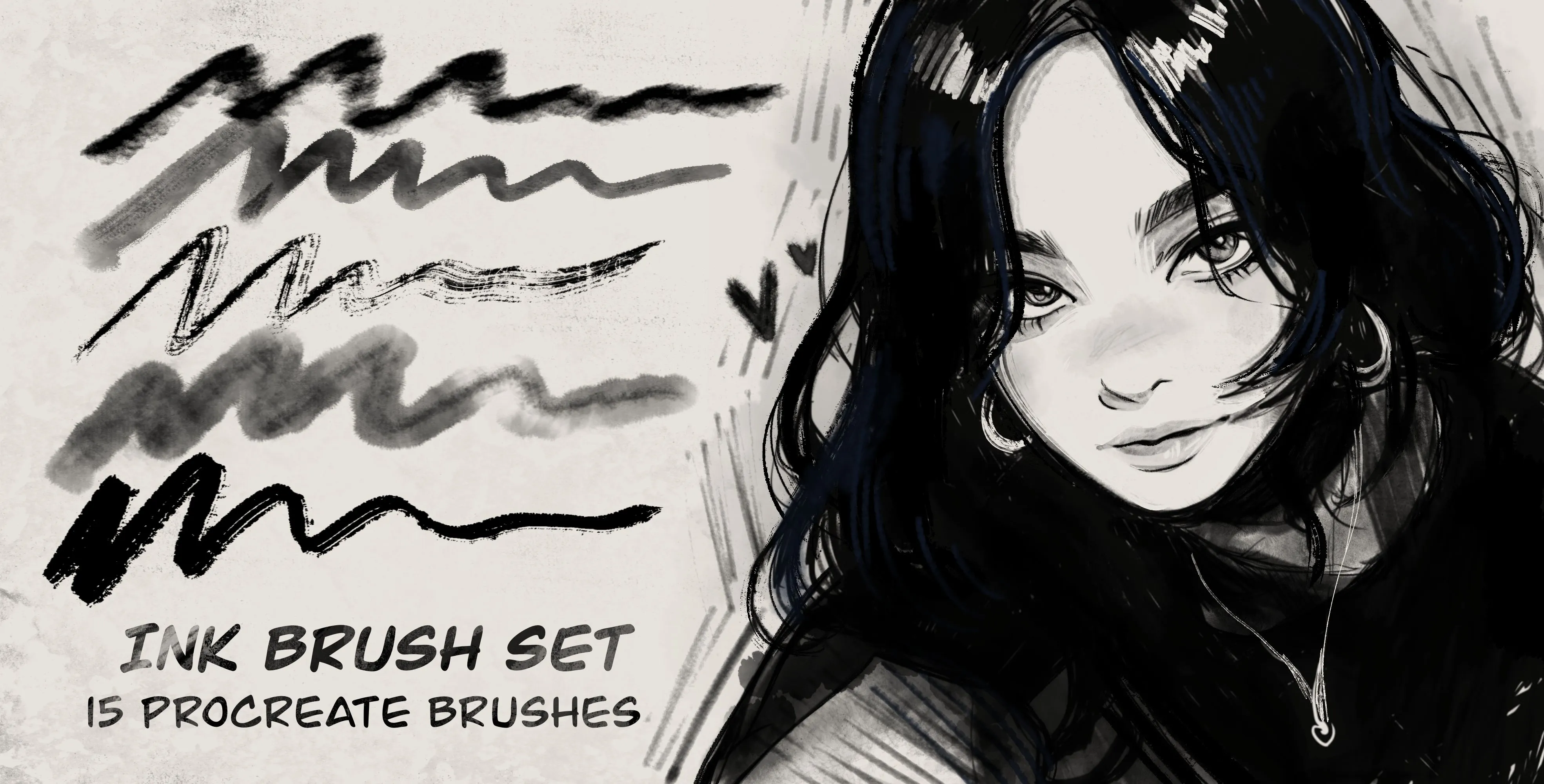
Ink
smooth ink pens, sharp flow and wet nib, dusty and rough ink, smudge and shadow ink
Procreate Video
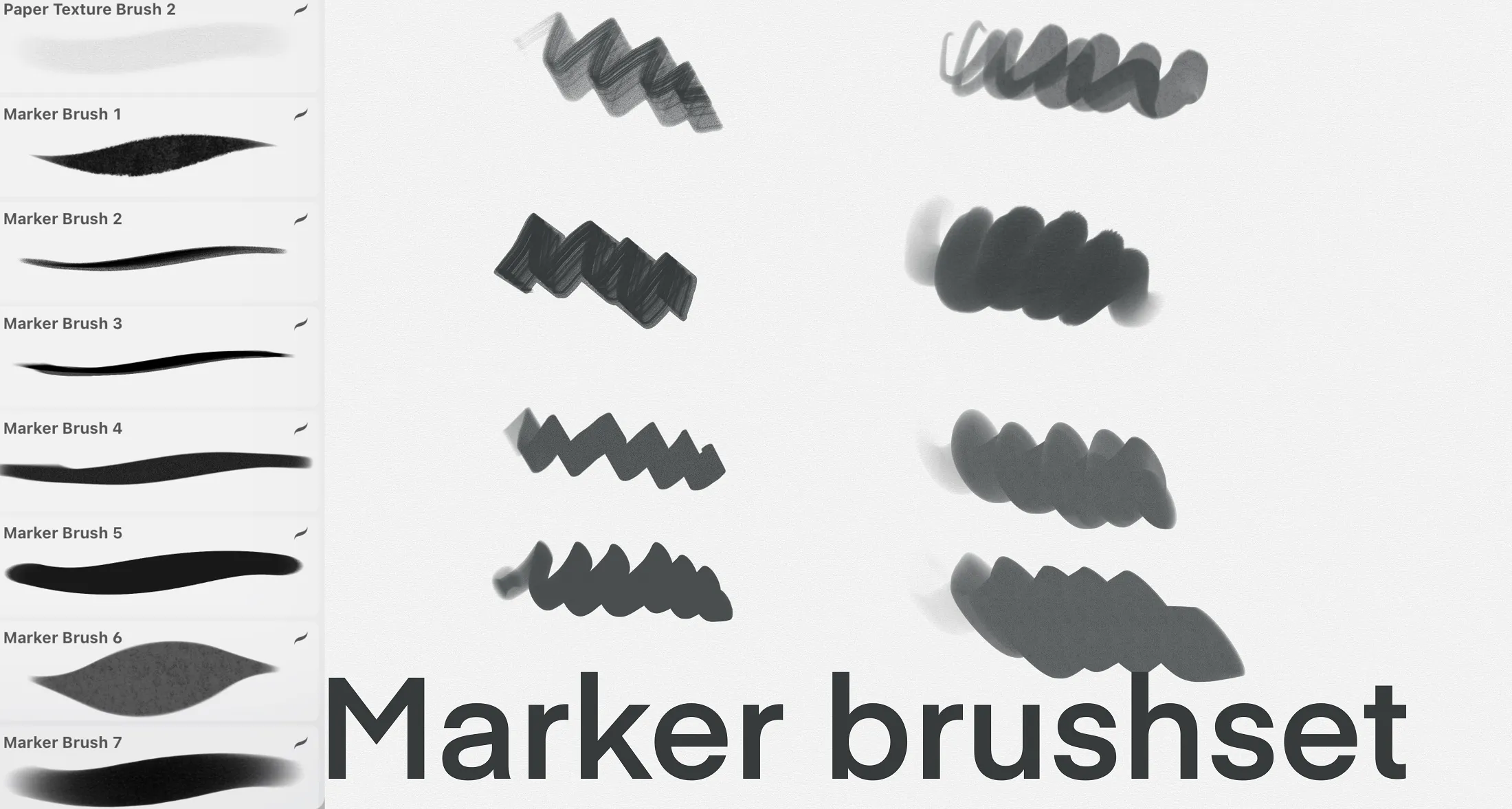
Markers
fine, broad, bold, soft-edge and smooth
 Procreate Video
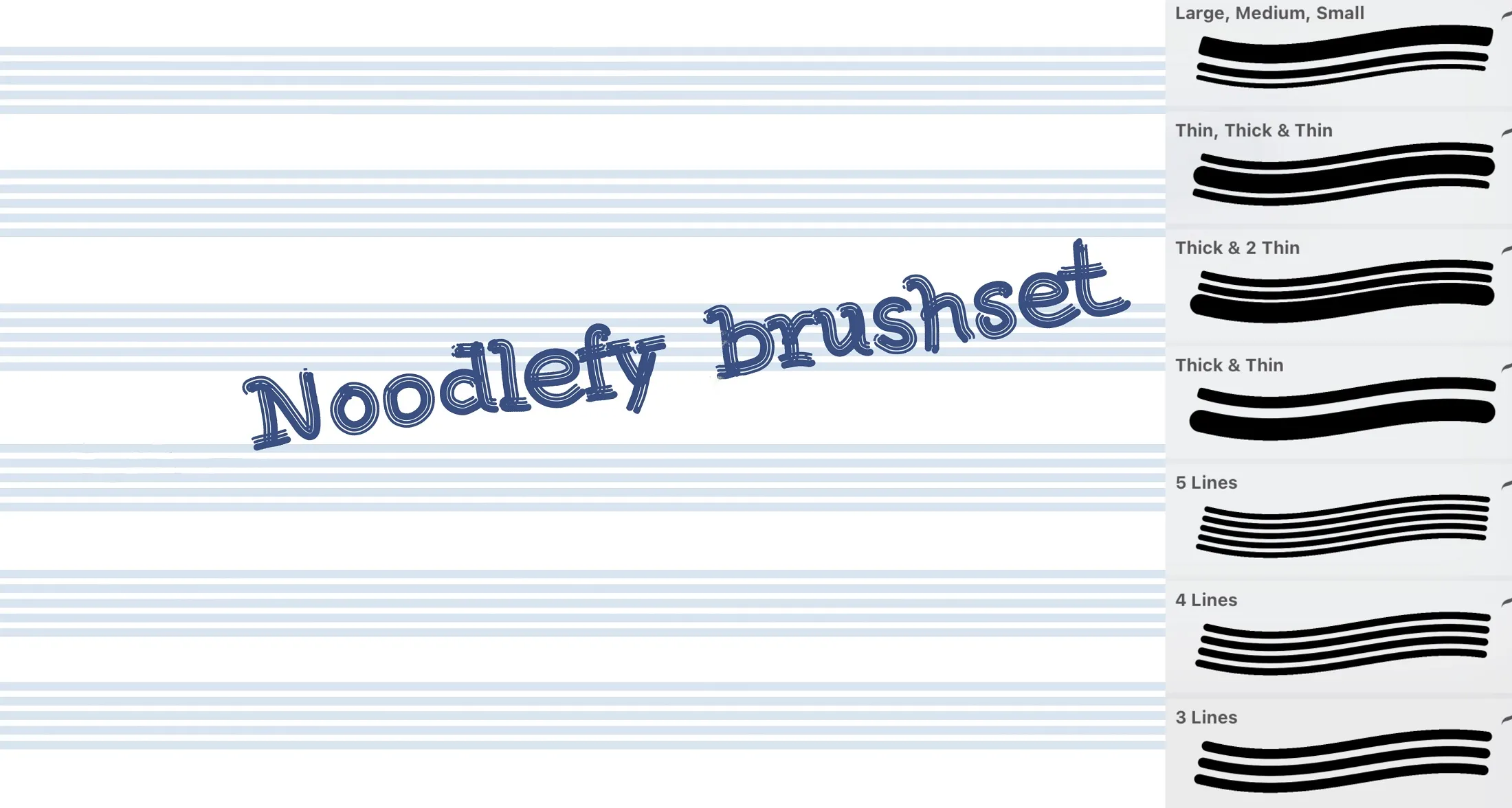
Noodlefy
parallel lines at once
 Procreate Video
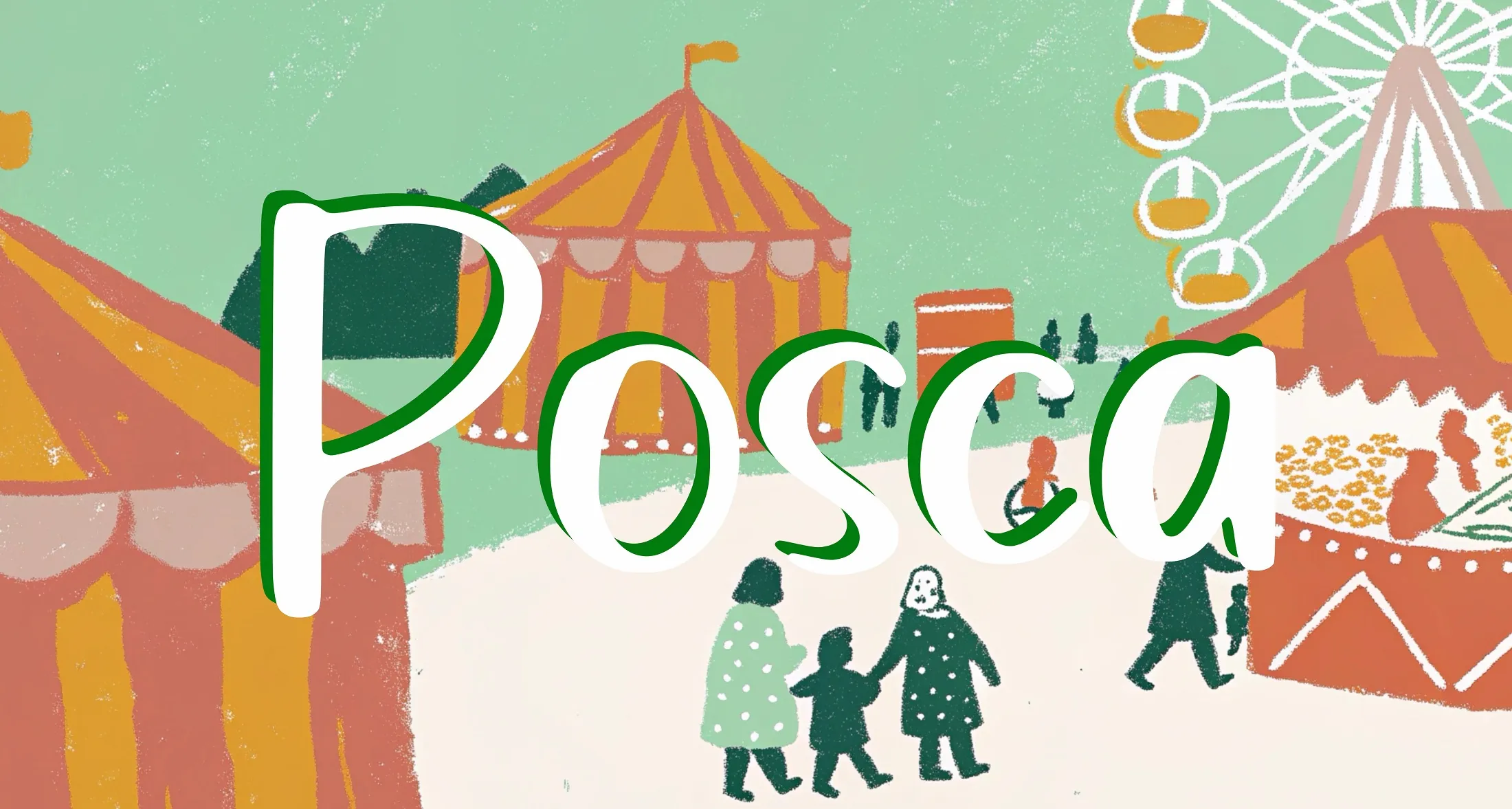
Posca Brushes
wet, dry, basic Posca markers and glitter
 Scan → get the app
More brush packs in the app
The site is still filling up — the Brusher app already has the complete 200+ set library, with more lettering packs, all one-tap installs into Procreate.
Popular lettering styles
Brush lettering vs calligraphy — which brush do you need?
Calligraphy is about consistent, structured strokes made with a pen that has a fixed relationship between angle and line width — think copperplate or Spencerian. For that you want a firm brush with strong pressure response and a slim taper.
Brush lettering is looser and more expressive: you draw letters as shapes and lean on dramatic thick-thin contrast. A softer, springier brush with a wider dynamic range suits it better. Most lettering artists keep one of each and switch depending on the piece — so a set that includes both is the safe starting point.
Getting clean thick-to-thin strokes
The magic of digital lettering lives in two Brush Studio settings: pressure → size and StreamLine. Pressure-to-size gives you the swell on downstrokes; StreamLine smooths out the wobble in your hand so long curves stay confident. If your letters look shaky, raise StreamLine before you blame your technique.
For colour and depth, letter in a single flat colour first, then add a shadow brush on a layer beneath and a soft highlight on a layer above. Keeping structure, shadow and highlight on separate layers is the single biggest upgrade to hand-lettered work in Procreate.
How to hand-letter a word in Procreate
A repeatable five-minute workflow that takes a word from rough layout to polished, colour-lettered artwork using a brush-script pen.
- 1
Rough the layout
On a low-opacity layer, sketch the word loosely with a pencil brush. Nail the baseline, x-height and spacing now — fixing rhythm later is painful.
- 2
Set your pen dynamics
Pick a brush-script pen and open Brush Studio. Map Apple Pencil pressure to size and nudge StreamLine up to around 40–60% for smooth, confident curves.
- 3
Letter the downstrokes heavy
On a new layer, trace your rough. Press firmly on every downstroke and lift to almost nothing on upstrokes — that contrast is what reads as calligraphy.
- 4
Refine the letterforms
Hide the rough layer and clean up. Use Selection and Transform to align letters, and redraw any stroke whose weight fights the others.
- 5
Add shadow and highlight
Add a shadow brush on a layer beneath the lettering and a soft highlight above it. Keep both subtle — they should imply depth, not shout.
- 6
Add texture and export
Finish with a light grain or a background texture for a printed feel, then export as PNG for social or a layered PSD to keep editing.
New to hand lettering? Start with a monoline pen, master consistent spacing, and only move to high-contrast brush script once your rhythm is steady.
Lettering brushes — FAQ
What are the best lettering brushes for beginners?+
Start with a monoline brush pen — it has even line weight, so you can focus on letterforms and spacing before worrying about pressure control. Once your rhythm is steady, graduate to a brush-script pen with strong pressure-to-size for that thick-thin calligraphy look.
What's the difference between calligraphy and lettering?+
Calligraphy is the art of writing letters in consistent, rule-based strokes with a pen; hand lettering is drawing letters as illustrated shapes. Calligraphy suits a firm pointed-pen brush, while expressive lettering wants a softer, springier brush with wide thick-thin contrast.
How do I add colour and shadow to my lettering?+
Letter in one flat colour on its own layer, then add a shadow brush on a layer beneath and a soft highlight on a layer above. Keeping structure, shadow and highlight separated is the fastest way to make flat lettering look dimensional.
Are these a good brush-pen alternative for the iPad?+
Yes — a pressure-sensitive brush-script pen in Procreate mimics a real pointed brush pen without the mess, and you get unlimited undo, adjustable smoothing and instant colour changes. Many letterers move to iPad precisely to skip ruined nibs and drying ink.